Walk into any bottle shop and you’ll notice something straight away. Some beers practically jump off the shelf while others fade into the background. The difference? It’s rarely about what’s inside the bottle at first glance. Your eyes lock onto the packaging, the colours, the texture, the story being told through design choices that feel deliberate and authentic.
First Impressions Are Everything (And Your Label’s Got One Shot)
- Visual First Contact: The moment someone spots your beer labels on a shelf, you’ve got maybe three seconds to make an impression. That’s not long enough for elaborate backstories or complex messaging. What works is immediate visual impact paired with personality. Matte finishes suggest craft authenticity, glossy surfaces hint at premium quality, and textured papers tell customers this brewery cares about details. Each choice whispers something different about what’s waiting inside.
- The Print Technology Behind the Story: When breweries invest in quality label printing, they’re not just slapping names on bottles. They’re building brand recognition through tactile experiences and visual consistency. The printing method affects everything from colour vibrancy to durability under refrigeration. Digital printing allows for shorter runs with variable designs, perfect for seasonal releases or limited editions. Traditional offset printing delivers that crisp, professional finish larger breweries need for nationwide distribution.
Design Choices That Actually Make People Stop Scrolling
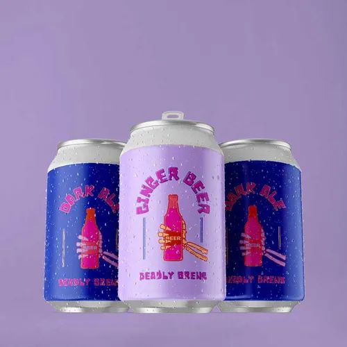
- Colour Psychology in Action: Amber tones suggest traditional ales, deep blues hint at crisp lagers, and bold reds promise something with kick. Your label’s colour palette does heavy lifting before anyone reads a single word. Local breweries often lean into earthy tones and hand-drawn aesthetics because these choices signal small-batch authenticity. Larger operations might choose cleaner, bolder designs that photograph well for social media sharing. And let’s be honest, if it doesn’t look good on Instagram, did it even happen?
- Typography Tells Tales (Sometimes Cheeky Ones): Font choices reveal personality faster than most brewers realise. Script fonts feel artisanal and small-batch. Bold sans-serifs scream modern craft beer culture. Vintage-style lettering transports drinkers to brewing traditions of decades past. The typography on your label becomes part of your brewery’s visual language, showing up on tap handles, merchandise and marketing materials that build brand recognition over time. Choose wisely because that font is going to follow you around.
Material Choices That Actually Matter (Not Just Marketing Fluff)
Your label material affects more than durability. It shapes customer perception from the first touch. Consider these practical options:
- Paper labels with matte finishes create that handcrafted, approachable feel perfect for local taproom sales.
- Polypropylene materials survive ice buckets and condensation without peeling, essential for restaurants and outdoor events.
- Textured papers add tactile interest that makes bottles feel special enough to gift or collect.
- Metallic finishes catch light beautifully, drawing attention in refrigerated display cases where competition is fierce.
Building Brand Recognition (Without Being Boring About It)
- Repeat Visual Language: Successful breweries develop recognisable label patterns across their range. Perhaps all your IPAs share similar colour schemes or your stouts feature consistent illustration styles. This visual family connection helps customers navigate your offerings and builds trust through professional presentation that suggests quality control extends beyond packaging into brewing standards. Think of it as your brewery’s signature look.
- Seasonal Releases That Keep Things Fresh: Limited runs let breweries experiment with bolder design choices whilst maintaining core brand identity. A summer ale might feature brighter colours and lighter fonts, whereas a winter warmer embraces darker, richer aesthetics. These variations keep regular customers engaged and create collecting opportunities for enthusiasts who appreciate thoughtful design evolution. Plus, seasonal drops give people something to look forward to beyond just another Friday night.
Beer labels do more than identify what’s inside the bottle. They start conversations, spark joy and transform casual buyers into brand advocates who’ll defend your IPA in heated pub debates. Quality label choices show customers your brewery takes pride in every detail, from recipe development through final packaging presentation. When your labels speak clearly and authentically, they become marketing tools that work around the clock, turning shelf space into storytelling opportunities that drive repeat purchases and genuine word-of-mouth recommendations. Ready to make your beer talk? Contact our team and start building labels that tell your brewery’s unique story with personality.
Featured Image Source: https://degqkf7c4iqz7.cloudfront.net/labexonpr/images/opt/products_gallery_images/Craft-Beer-Labels-Can.jpg.webp?v=7055